The Rock
Camp Shirts
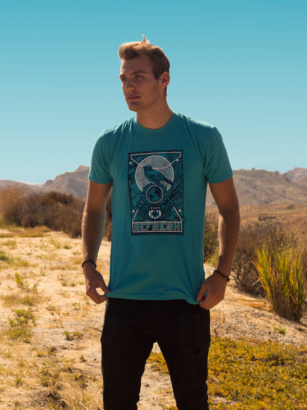
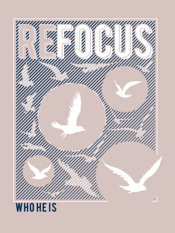
These shirts are meant to promote the camp ideals of The Rock; Refresh, Renew, and Refocus. The imagery used highlights the freedom and weightlessness that comes with joining the youth group. Not only do these shirts fit the branding guidelines needed for a project like this, I also designed them to be fashionable for the average youth – cool, patterned designs that feel both modern and timeless.
Designed and Photographed by Josh Zerhusen
Rocktoberfest Shirts
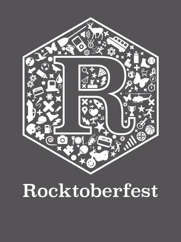
Rocktoberfest, in conjunction with Cornerstone’s youth organization, is an annual three-day discipleship event designed to bring the community together. Cornerstone commissioned the rebrand of Rocktoberfest in hopes to better reflect its young, modern audience.
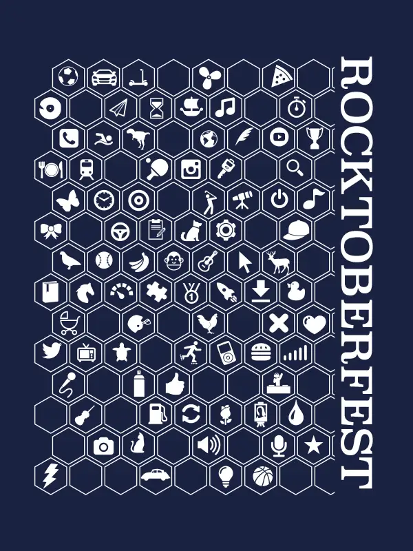
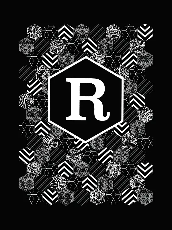
The apparel graphics pulled are based on the festival’s main event, the community scavenger hunt. Each shirt is composed of icons, representing the various tasks and trials experienced throughout the race. The hexagon, which can be seen throughout the event’s brand identity, is used to symbolize “a hive”- to further push the community aspect of the event. The now iconic shape has developed into its own modular system, acting as a frame work for all future Rocktoberfest designs.
Welcome Video
The Rock’s welcome video continues the modern look used earlier for their t-shirts. I designed this welcome video to include quick text graphics that easily communicate The Rock is young, full of life, and focused on Christ. The silver chromatic look of the opening graphic highlights the modernness of the organization, while the organic sphere shapes remind them that this is still a flexible and fun environment.
